



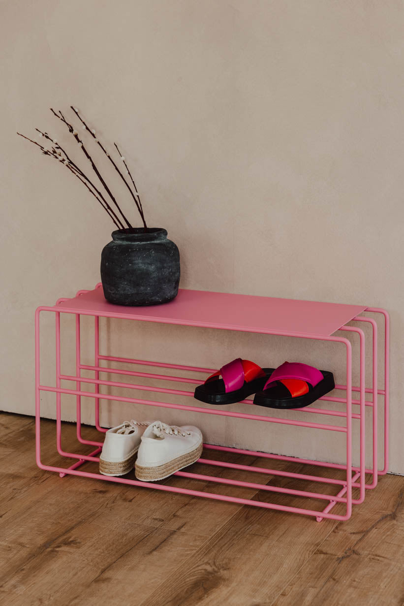
Pastel, neutral or bright colors? This is how you find the right color palette
Choosing the right color palette has a decisive influence on how a room looks. Colors influence the atmosphere, feeling of space and even our well-being. Whether soft pastel tones, timeless neutral colors or bold statement colors - each direction has its own impact and style. But which color palette suits your home? And how do you combine colors harmoniously without making the room appear overloaded? This guide will help you find the perfect balance between pastel colors, neutral tones and bright colors.

Pastel colors - soft tones with a big impact
Pastel colors represent lightness, freshness and modern restraint. Typical nuances such as mint, rosé, light blue or a delicate sage have a calm, soft and style-defining effect. Pastel tones have been making a strong comeback in interior design in particular in recent years - especially in Scandinavian style and Japandi interiors.
Why pastel colors are so popular:
-
They make rooms appear larger and airier
-
They create a calm, harmonious atmosphere
-
They bring color into play without appearing dominant
-
They can be combined excellently with wood, metal and natural materials
Pastel is ideal for living rooms and bedrooms, but also for modern kitchens or home offices where a gentle, inspiring atmosphere is required.
Combining pastels - the best color combinations
Pastel colors have a particularly strong effect when they are deliberately combined. It is important not to use too many different tones in order to maintain the calm effect.
Popular combinations in interior design:
-
Pastel + white: A classic for bright, Scandinavian rooms. White enhances the lightness of pastel tones.
-
Pastel + Gray: Gray gives pastel colors more depth and modernity - perfect for minimalist interiors.
-
Pastel + natural wood: Light oak or ash bring warmth and grounding to the color concept.
-
Tone-on-tone pastel: Several shades of the same color family (e.g. sage, mint and muted green) have a particularly harmonious effect.
Tip: Pastel colors work particularly well on larger areas such as walls or furniture because they are not too dominant effective.

Neutral colors – timeless elegance for every style
Neutral colors such as beige, cream, sand, taupe, gray or off-white are among the most important basics of modern interior design. They appear calm, high-quality and create an atmosphere that is not dependent on short-term trends. This is precisely why they are so versatile: neutral colors make materials, shapes and proportions appear stronger and give furniture and accessories the opportunity to develop their effect. This makes rooms appear more harmonious, tidy and often even more spacious. At the same time, neutral color palettes offer maximum flexibility because they can be supplemented with new accents at any time without having to change the entire furnishing concept. Anyone who thinks long-term and wants to create an interior that will still look modern many years from now often relies on a calm, neutral basis.
Minimalism & Scandinavian style: Why neutral colors dominate
In minimalist and Scandinavian influenced interior design, neutral colors play a central role because they direct the focus to the essentials. Both styles rely on clarity, functionality and a reduced design language in which every element is deliberately chosen. Bright, reserved nuances support this effect by making rooms appear open, light and structured. Instead of creating visual stimuli through strong colors, tension is created through materials, surfaces and light. Wood, metal, linen or ceramic gain presence and give the room depth. Neutral color schemes also promote a feeling of peace and order - one reason why they are particularly popular in living spaces that are intended to serve as a place of retreat. They create a timeless stage on which design and personality can unfold subtly but effectively.

Bright colors - bold accents with personality
Bright colors such as strong blue, intense green, bright yellow or a strong red bring energy into the room. They are an expression of individuality and make clear statements.
Bright colors are particularly suitable for:
-
Accent walls
-
Individual pieces of furniture
-
Accessories such as cushions, carpets or art
-
Design highlights in the room
What is important, however, is this Dosage Too many intense colors can quickly appear restless. That's why the 60-30-10 rule is recommended in interior design:
-
60% primary color (usually neutral)
-
30% secondary color
-
10% accent or statement color
So the room remains harmonious, while strong colors have a targeted effect.
Use statement colors correctly
Statement colors develop their best effect when they are deliberately staged. Instead of dominating the entire room, they should set highlights.
Strategies for the right use:
-
Create contrast: A strong color looks particularly strong against a neutral background.
-
Include materials: Matte, shiny, metal or textile - the surface structure influences the effect of the color significant.
-
Create repetition: An accent color should appear in at least two to three places in the room in order to appear harmonious.
-
Consider room function: Bold colors are more suitable for living areas or creative rooms than for bedrooms in which calm is the priority.


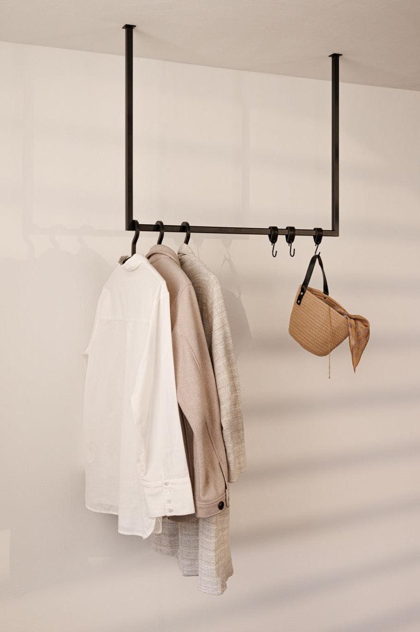
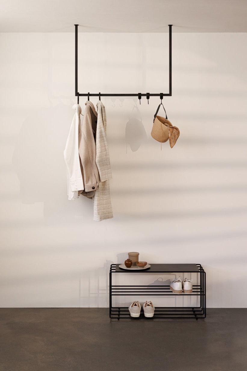
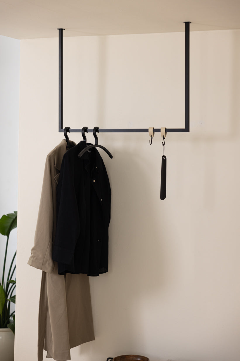
Which colors go with black? – Styling and interior design tips
Interior trend organic furniture shapes: How to design rooms with curves